


Edward Hopper has never lived on my list of the top artists of the 20th Century. Even with his iconic imagery and stylized romance of urban New York City, as well as rural Cape Cod, it has always been hard for me to get over his focus towards representational painting.
As strange as it might sound, and while they were contemporaries of sorts (Hopper was 30 years older but would outlive “Jack the Dripper” by 11 years), Jackson Pollock’s paint drips always seemed like they were liquid Jimi Hendrix reinventing an electric guitar in contrast to the Ella Fitzgerald that could almost be heard crooning in the backroom of some of Hopper’s interiors.
In short, although they were nostalgic and romantic and charming— the Hopper’s were my parent’s paintings, while the Abstract Expressionists and after were mine.
That said, the Edward Hopper exhibition at the Museum of Fine Arts is the big thing to see for us artsy types (or even somewhat artsy types) this summer in Boston, and today I ventured over to check it out.
As a side note, I have to admit it is interesting how open-minded I have become now that my own work has moved from the more “abstract” to representational:
hyp·o·crite / Pronunciation Key - [hip-uh-krit]
a person who pretends to have virtues, moral or religious beliefs, principles, etc., that he or she does not actually possess, esp. a person whose actions belie stated beliefs.
(from Dictionary.com)
One of my ex-girlfriends always said I was a hypocrite. Maybe she was right after all.
Moving on...
So, what did I find at this big-deal exhibition of an American art icon?
To sum it up in three words: green, green, green.
The paintings— at least the best ones to my eye— are so very rich and stylized in their color and light they are incredibly visually moving. They are much different, and more complex and nuanced, than I had expected after seeing so many glossy reprints of his work over the years. Hopper’s deft use of oil paints allows for reds that are brick-colored and brown; scarlet and muted all at once. Certainly his watercolors and etchings are an amazing treat— his attention to line and compositional layout and detail are highlighted by the inclusion of these works— but his most moving pieces are those oil paintings that set a modern green against an urban, brick, red— and the result is incredible.
I’ve talked before about the pitfalls of using green for us painters— and how overpowering it can be. Truly, how awful it can be (see blog post “Orange and Green from May 10th http://617midway.blogspot.com/2007/05/orange-and-green.html). Beyond my appreciation as a whole for Hopper’s evocative style, rich, rich colors, and expert handling of light, I thought:
This guy handles green, and to greater effect, than any other artist I can think of.
I’m not talking about John Constable’s green trees of a British landscape, or the deep greens of Monet’s water lilies— rather, Hopper’s greens are the man made greens of modern America; the green of my Grandmother’s salad bowls, the greens of the motel walls that Hilton never took over and the original owners haven’t covered up yet. In Hopper’s able hands, this color— when matched against that urban, brick red, of New York in expansion, create a style and color palette that is deep and moving and wonderful.
On of my favorites was Room in New York from 1932, pictured above (borrowed from the Artblog site http://www.artblog.net/) which shows that when I refer to the reds I don’t always literally mean the brick— the woman’s dress and the armchair play against the green paint of the wall. In person this paintings is magnificent.
Interestingly enough, many of the reproductions I found of it online have color-corrected the green of the wall to a yellow— only in person can you appreciate the subtle contrast of color and mood Hopper achieves in many of these works.
And the greens can be found in the color of the blinds in one image (for instance, Room in Brooklyn from 1932) or a woman’s sweater (as with Chop Suey from 1929), or the ceiling and walls of a movie theater (as with New York Movie from 1939).
Yes, there are others— the lighthouses and sailboats, the watercolors of Cape Cod and Gloucester houses, but the powerhouse paintings are those that play these colors against one another along with the poses of houses, figures, sky, etc.
And there is something wonderful about the statement in so many of these paintings of the interplay between urban and rural— the man made and the natural, In one painting a lighthouse towers over the sky and in the next a well-lit apartment building gives way to a pathway leading into the dark woods. Many of his canvases are framed in this way— a fence sealing off the natural world from a beach house, or the sky set imposing over a brick building. It is a theme that however subconsciously repeats and is fitting for an artist who was one of the last gasps of truly “modern” painting.
One of the bigger treats in the exhibition was Hopper’s actual sketchbook. There was something magical about seeing sketches of his own paintings and then the recording of the sale prices, etc. In fact, this is probably one of the better aspects of the Museum of Fine Arts website offering that accompanies the show. Online, web-surfers can flip through Hopper’s sketchbook and zoom in on different pages. While there is something powerful in seeing his real sketchbook encased center stage in the gallery, the online piece is great in its own right. Definitely one of the better features I have seen accompanying a show in our age of internet options and extras (http://www.mfa.org/).
There was also a section in the actual galleries that featured a selection of Hopper paintings on a monitor coupled with a photograph of the actual place now (for instance the Cape Cod houses he captured in paint). This part wasn’t as interesting to me, as by the time I reached it I was immersed in Hopper’s stylized world awash with his modern light and colors— and didn’t want to be yanked back to bland reality.
Overall, the paintings evoked an emotion of melancholy and romance as with a Raymond Chandler book featuring gumshoe Philip Marlowe. Even in Nighthawks, my mind wanders to a blonde who is capital “T” trouble alongside Chandler’s famous anti-hero asking the soda jerk what happened there 3 nights ago before some unlucky stiff got murdered.
Or another one of my favorites Western Motel from 1957 (borrowed here from the Yale Art Gallery http://artgallery.yale.edu/) seems to play out a scene from Robert B. Parker’s treatment of Marlowe’s character in the novel “Poodle Springs.”
Again, the red and green are spectacular— as is the mirroring of the form of the armchair with the roll of the hills in the background. The palette gives these paintings their own distinct light that seems like we are seeing the world through the eyes of a detective from a piece of detective pulp fiction.
In the museum shop I noted that this wasn’t only me who caught this— amidst every type of marketable sailboat book, coaster, magnet, etc. there was a book on film noir (The Art of Noir by Eddie Muller) for sale that I already count in my collection.
An aside: Raymond Chandler is likely one of the finest prose writers of the 20th Century. Go pick up “The Long Goodbye.”
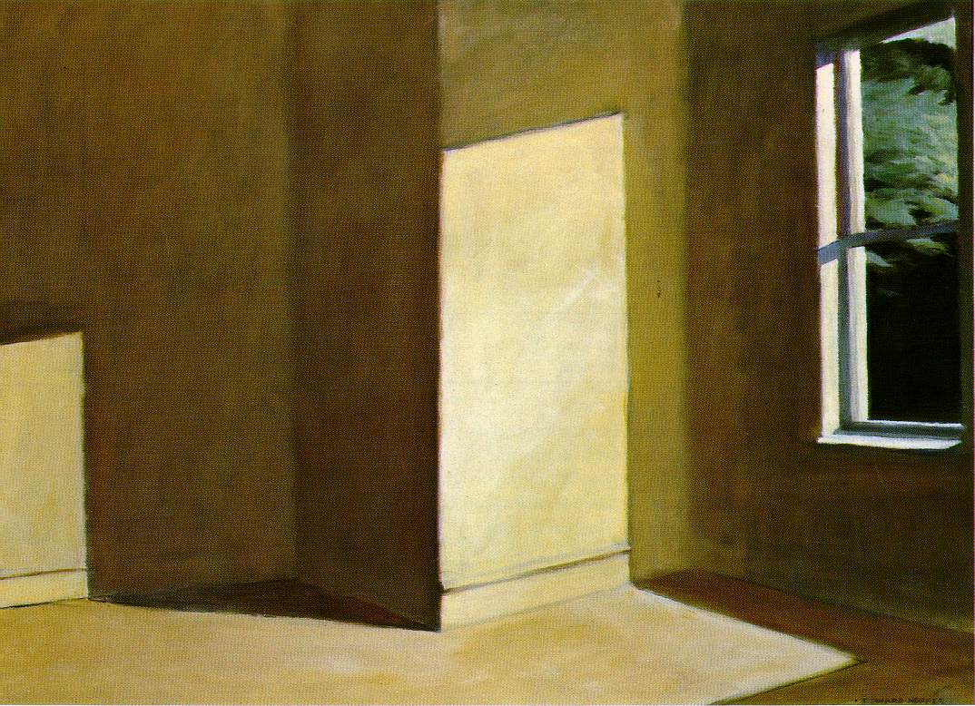
My favorite curatorial placement in the Hopper show was also one of my favorite paintings, Sun in an Empty Room from 1963 (shown here from http://www.erratamag.com/images/hopper/sunemptyroom.jpg).
Stripped down to the squares of light and the empty room, the painting is just as much about the relationship between things (characters as Rothko’s squares were actors in a drama), or people, or the tension between urban and rural, and is just as moving and visually interesting. Plus, to be presented with this as the last piece in the show— everything removed from the room, with us wondering if the unseen boxes packed off camera will be moved in or moved away. There is certainly a theme of mortality and of that which does or does not endure, in this amazing painting.
Plus, it makes a great bridge for me personally between the abstract and the representational and somehow marries the two perfectly.
Maybe that ex-girlfriend wasn’t so right after all.
Edward Hopper runs until August 19th, 2007 at the Museum of Fine Arts in Boston.
No comments:
Post a Comment